Colour Contrast Checker: Meet WCAG AA and AAA Accessibility
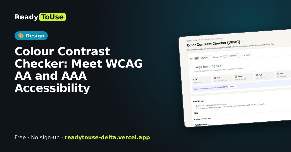
Low-contrast text is hard to read, especially on phones in the sun. Check your text and background colours against WCAG AA and AAA rules, with a suggested fix.
Open the free Color Contrast Checker (WCAG) →What is the Color Contrast Checker?
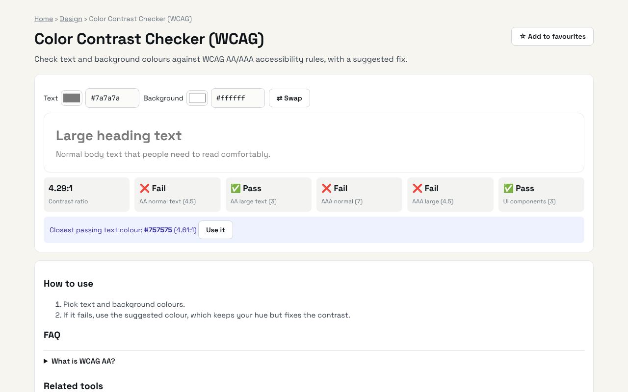
Check text and background colours against WCAG AA/AAA accessibility rules, with a suggested fix. It's completely free, needs no sign-up and works on any phone or computer.
Why it's helpful
- Pass/fail for AA and AAA
- Suggests a fixed colour
- Normal and large text checks
Who it's for
Designers, developers and anyone building accessible websites.
How to use it
- Pick text and background colours.
- If it fails, use the suggested colour, which keeps your hue but fixes the contrast.
💻 Open source: this tool is free and open source (MIT License). View the code on GitHub, download it and run it offline.
The bigger picture: Design
Good design builds trust in seconds. Colour, typography, spacing and accessibility tools help developers and small businesses create websites that look professional without hiring a full design team.
What's changing: Accessibility is moving from nice-to-have to expected, and modern CSS now does with a few lines what used to need images and JavaScript.
Frequently asked questions
What is WCAG AA?
The accessibility level most laws and companies target: 4.5:1 for normal text and 3:1 for large text.